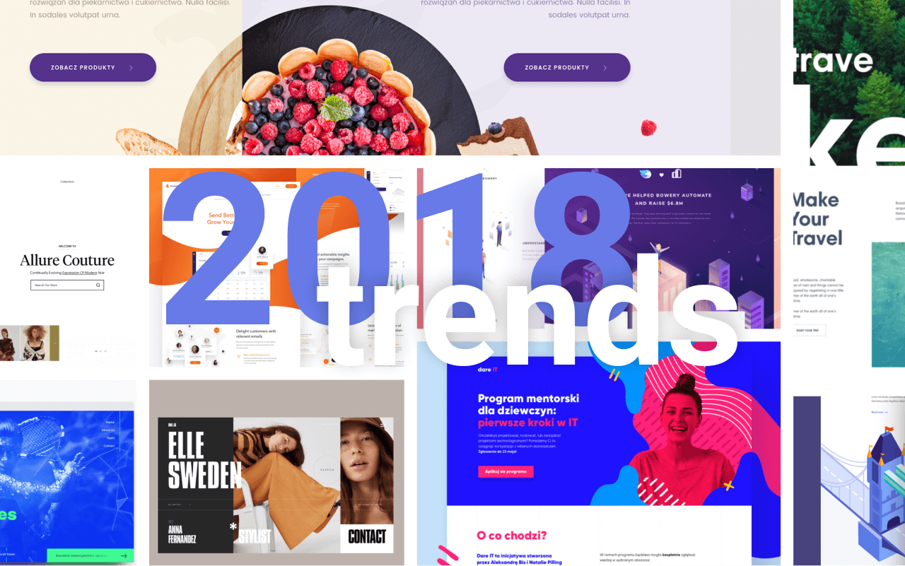
Are you planning to launch a website this year or are you considering restyling your current one? Then it’s good to know what users expect from a website in 2018.
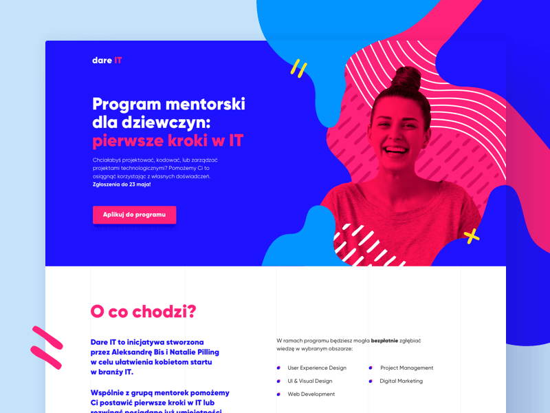
Backgrounds don’t need to be straight anymore
In 2018, there’s more room for fluid backgrounds on websites. Whereas in previous years, many designs featured straight, crisp lines, this year, designs are literally going in all directions.
Fluid backgrounds are not only used in the page header; they also appear throughout the rest of the website in various flowing shapes.
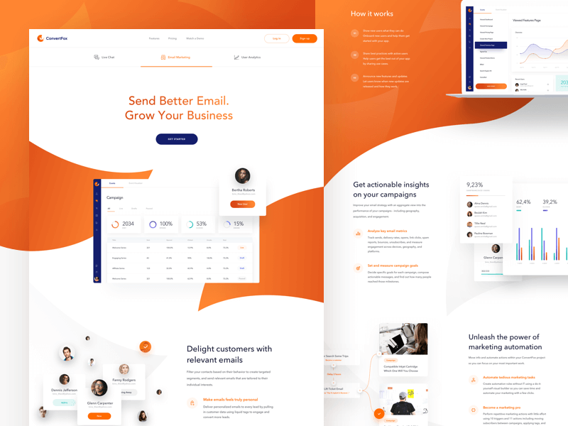
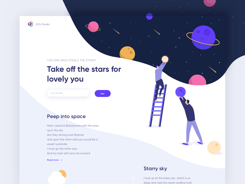
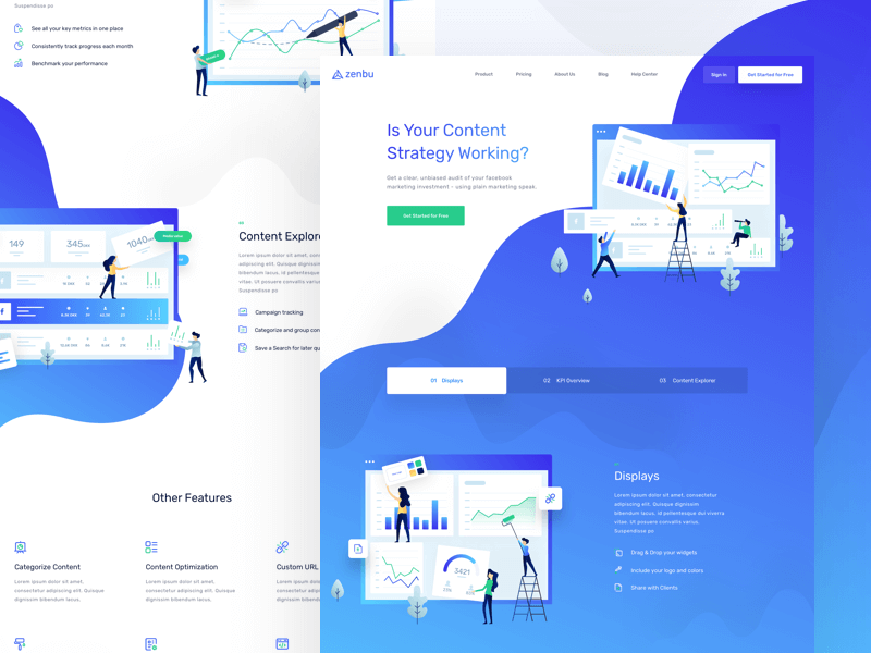
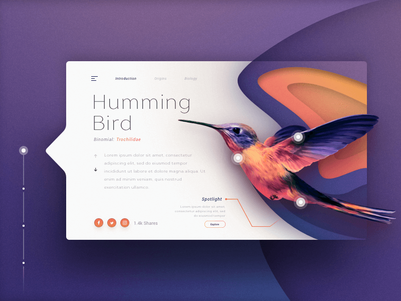
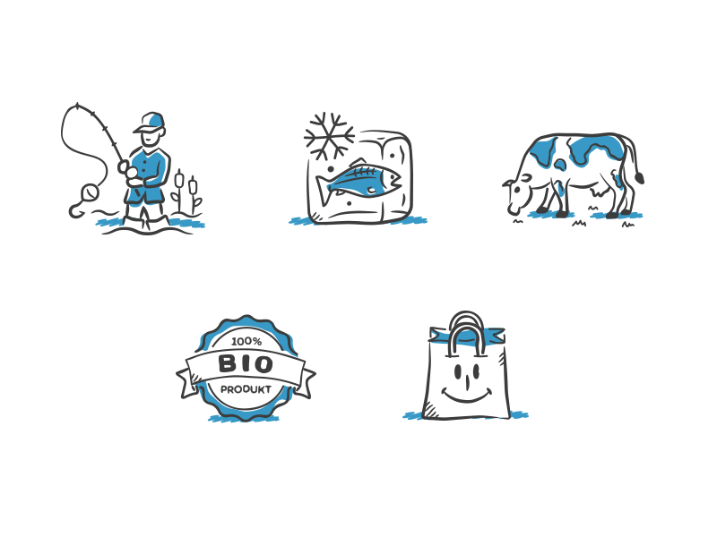
Photos making way for illustrations
In 2017, almost every website featured a “header” with a large photo and text. In 2018, illustrations are taking the place of photos. It’s going to be a good year for artists and illustrators.
Often it doesn’t stop at just one illustration, but rather a complete series of illustrations is created. These illustrations are typically accompanied by explanatory text and together highlight a component or service.
Step away from the grid
2018 is the year for experimentation. With the introduction of new CSS tools, it’s possible to create more playful designs. It’s no longer necessary to place everything within a grid.
“With great power comes great responsibility.” This certainly holds true when you start experimenting with content placement outside of a grid. Ensure it doesn’t turn into an unmanageable mess and plan your website carefully.
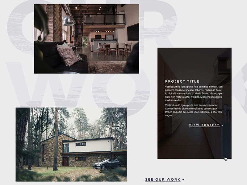
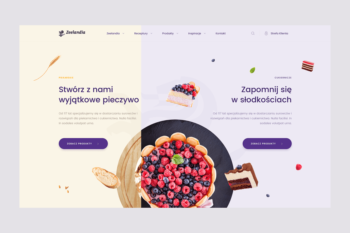
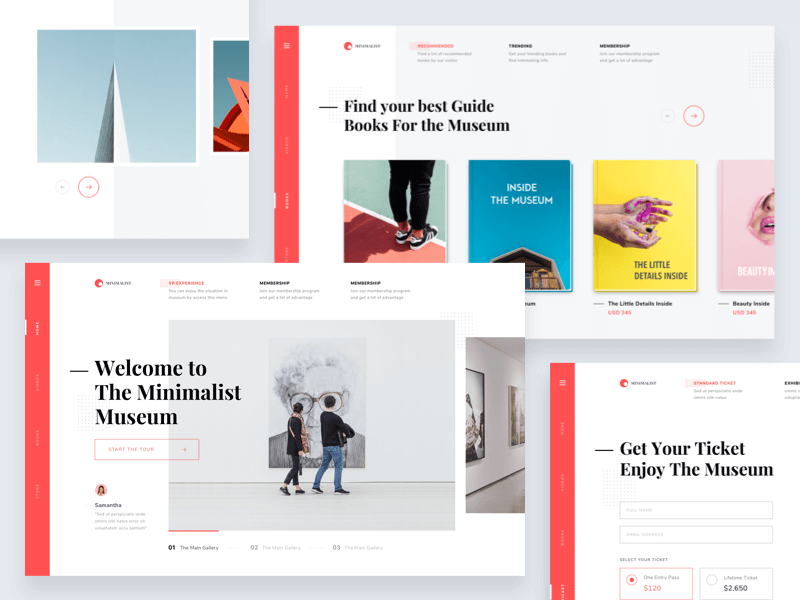
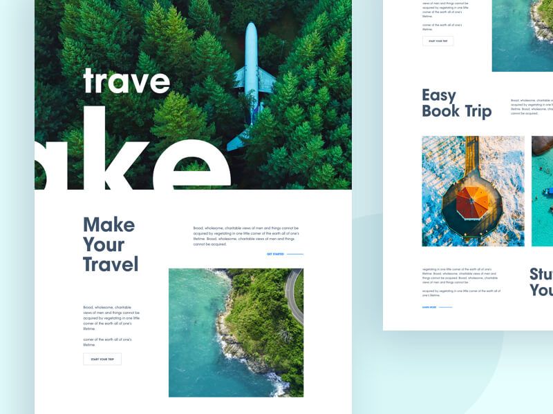
Split screen layouts
Split screen layouts are making a comeback. As screens become larger, there’s plenty of experimentation with placing different content side by side.
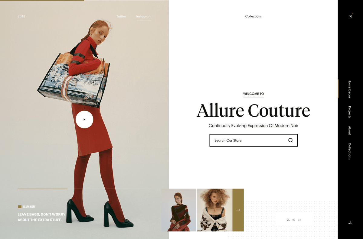
It’s especially popular to place a large photo or video next to text. Split screen layouts are characterized by taking up the full width and height of the screen.
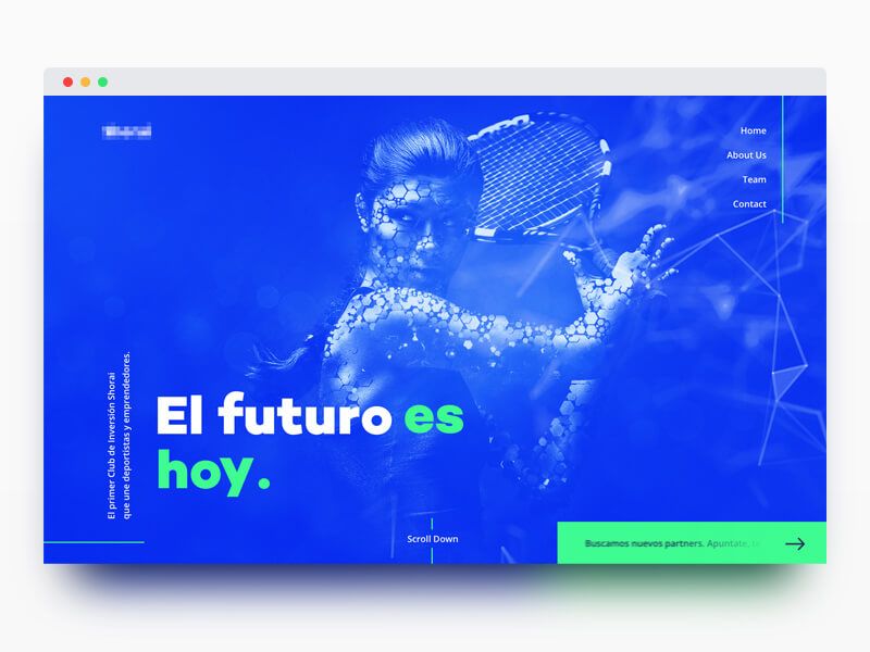
Combine bright colors
Dare to combine bright colors with each other. Does your brand have some vibrant colors? Try combining these with a photo, for example.
A dull stock photo can become a striking part of your brand with the right color combination. Don’t be afraid to experiment.
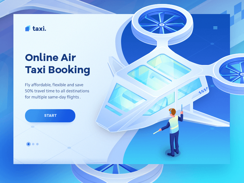
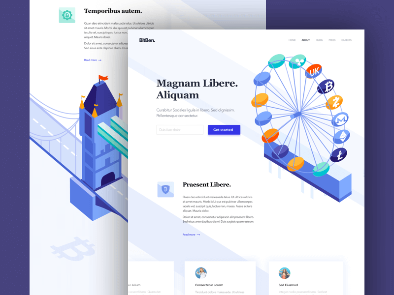
Isometric drawings
Isometric drawings are currently very popular and are mainly used by online software providers. Where it’s often difficult to depict a software service with photos, doing so with an illustration is much simpler.
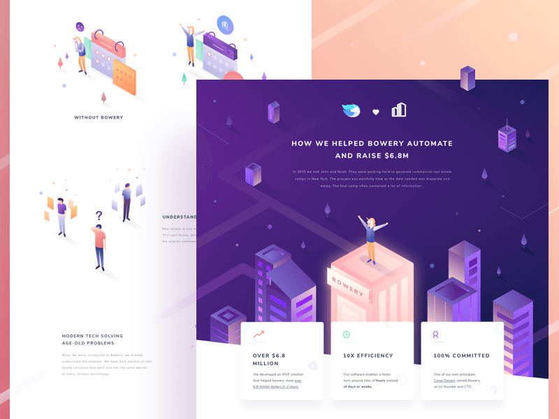
It’s important that the chosen angle of the drawing is consistently maintained throughout the entire website.
Horizontal layouts
In addition to split screen layouts, there is increasing experimentation with horizontal layouts. These are layouts that scroll horizontally rather than in the traditional vertical manner..
It’s also possible to combine horizontal and vertical scrolling. Just make sure it’s clear how users can navigate through the website.
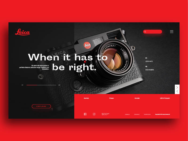
Text can be large and bold
Screens are getting larger, which means there’s more space for both images and text. Large, bold typography combined with images is a popular trend in 2018.
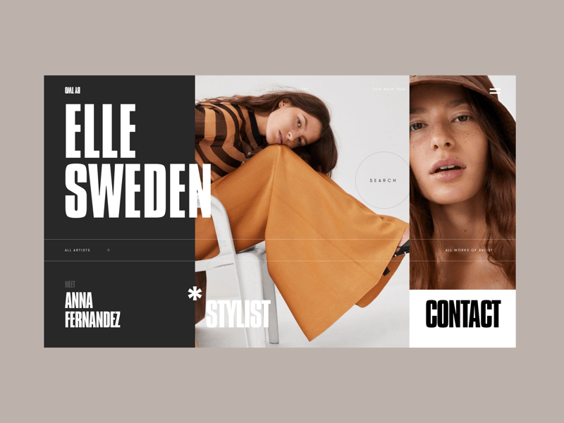
Make sure your texts are concise. No one wants to read long sentences spread over four lines.
More shadow for depth
Selling a product and want to draw extra attention to it? Try making your product stand out by adding an extra shadow. This way, the product will catch more attention.
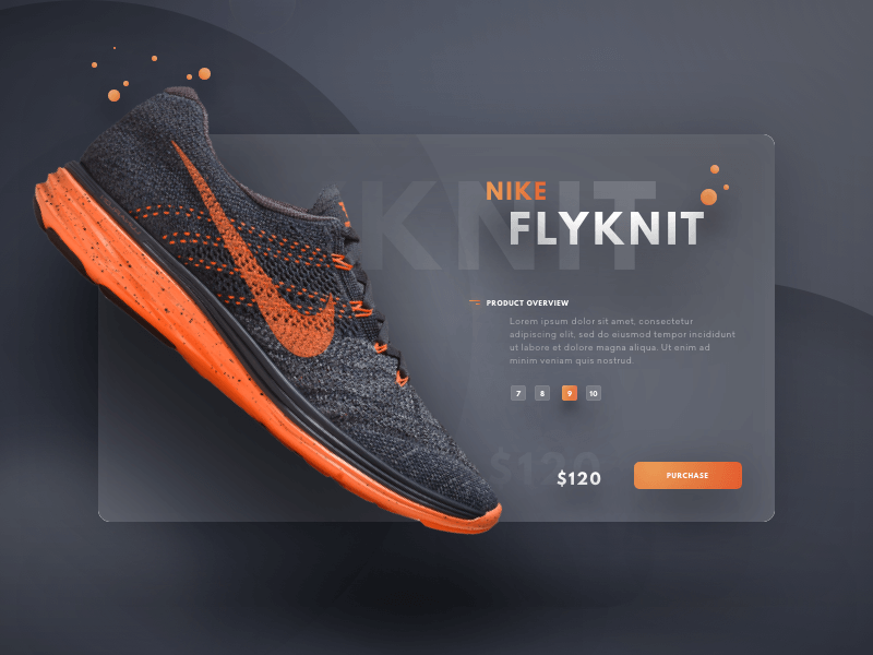
It’s not uncommon to create multiple levels of depth, but try to limit it to 3 or 4 levels.
Duotone icons
Icons have always been an important part of websites. In 2018, icons are getting an upgrade and are often presented in duotone colors. Single-color icons are on their way out in 2018.
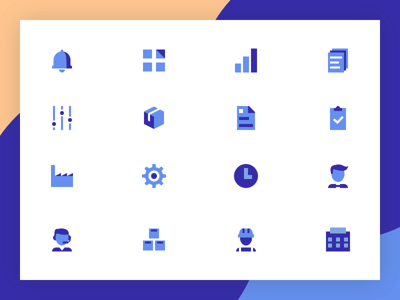
Duotone Icons come in various styles: sleek and professional or playful and cheerful. Find an icon set that fits well with your brand, or have one specially developed for your brand.
Trends move fast
2018 is still young and trends are already shifting. If you’re planning a new site or a redesign, don’t chase every trend on this list. Pick the ones that fit your brand and your audience, and do those well.